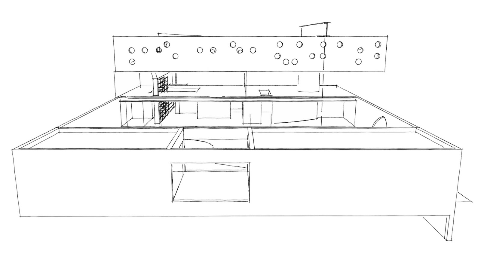
In researching this house, i found that the images available to the general public (internet or published) were all quite similar, in the fact that they showed all the same elements of the structure. This meant that there was a lot of missing information about different elements of the building. I watched the documentary house life. with the information i had already found, and the documentary, a lot of those missing elements were revealed.
I have captured clips from throughout the documentary that I found to be useful when It came to drawing my plans and sections etc, as well as modeling bordeaux house.

Clip 1 - This Clip shows a set of stairs leading from First Floor down to ground floor. However more importantly, it is one of the few shots that shows the sliding doors that are on an angle of approximately 60 degrees. These doors slide to the glazed wall. the purpose of this door is to shelter the stairwell that leads to the indoor ground floor area from the elements, i.e. rain.

Clip 2 - This clip shows the point at which the angled sliding door meets the glazed wall. At the time of filming this documentary the glass was being replaced, hence the plywood in its place.

Clip 3 - This clip shown the courtyard area between the two guest houses. It is important because all the information I have come across does not show this opening to be a window. It also shows the two walls on either side to be glazed as well.

Clip 4 - Clearly showing the foot bridge leading between the two very separate areas on the Second Floor; the children's bedrooms and the master suite.

Clip 5 - Shows the foot bridge spanning above and across the driveway, leading the the guest house.


 Clip 1 - This Clip shows a set of stairs leading from First Floor down to ground floor. However more importantly, it is one of the few shots that shows the sliding doors that are on an angle of approximately 60 degrees. These doors slide to the glazed wall. the purpose of this door is to shelter the stairwell that leads to the indoor ground floor area from the elements, i.e. rain.
 Clip 2 - This clip shows the point at which the angled sliding door meets the glazed wall. At the time of filming this documentary the glass was being replaced, hence the plywood in its place.
 Clip 3 - This clip shown the courtyard area between the two guest houses. It is important because all the information I have come across does not show this opening to be a window. It also shows the two walls on either side to be glazed as well.
 Clip 4 - Clearly showing the foot bridge leading between the two very separate areas on the Second Floor; the children's bedrooms and the master suite.
 Clip 5 - Shows the foot bridge spanning above and across the driveway, leading the the guest house.


